Visualization strategies
Every figure in PeakATail is produced by a registered VizStrategy subclass.
Strategies are grouped by plot_type (what the figure shows) and tagged by
engine (matplotlib, plotly, or scanpy). Multiple engines can be rendered in
a single call via render_all.
Engines are selected at runtime with --plot-engine matplotlib, plotly,
both, or none. Matplotlib produces static PNG + SVG files. Plotly produces
interactive HTML files. Scanpy produces figures via its built-in plotting
functions.
Every figure has a companion <stem>.meta.json sidecar file. The sidecar
records the strategy name, generation timestamp, PeakATail version, and
plot-specific provenance keys. A figures_INDEX.md and figures_INDEX.json
manifest is written to the top of each figures/ directory, grouping all
sidecars for human and machine consumption. See the
Figure sidecar convention section below.
umap
Registered names: umap_matplotlib, umap_plotly, umap_scanpy
Data shape: (adata, ds_id) — an AnnData with obsm["X_umap"] and
optionally obs["leiden"], plus a dataset identifier string.
What it shows: A 2-D scatter plot of cells in UMAP space. Points are
colored by Leiden cluster label when obs["leiden"] is present; otherwise
rendered in a single color.
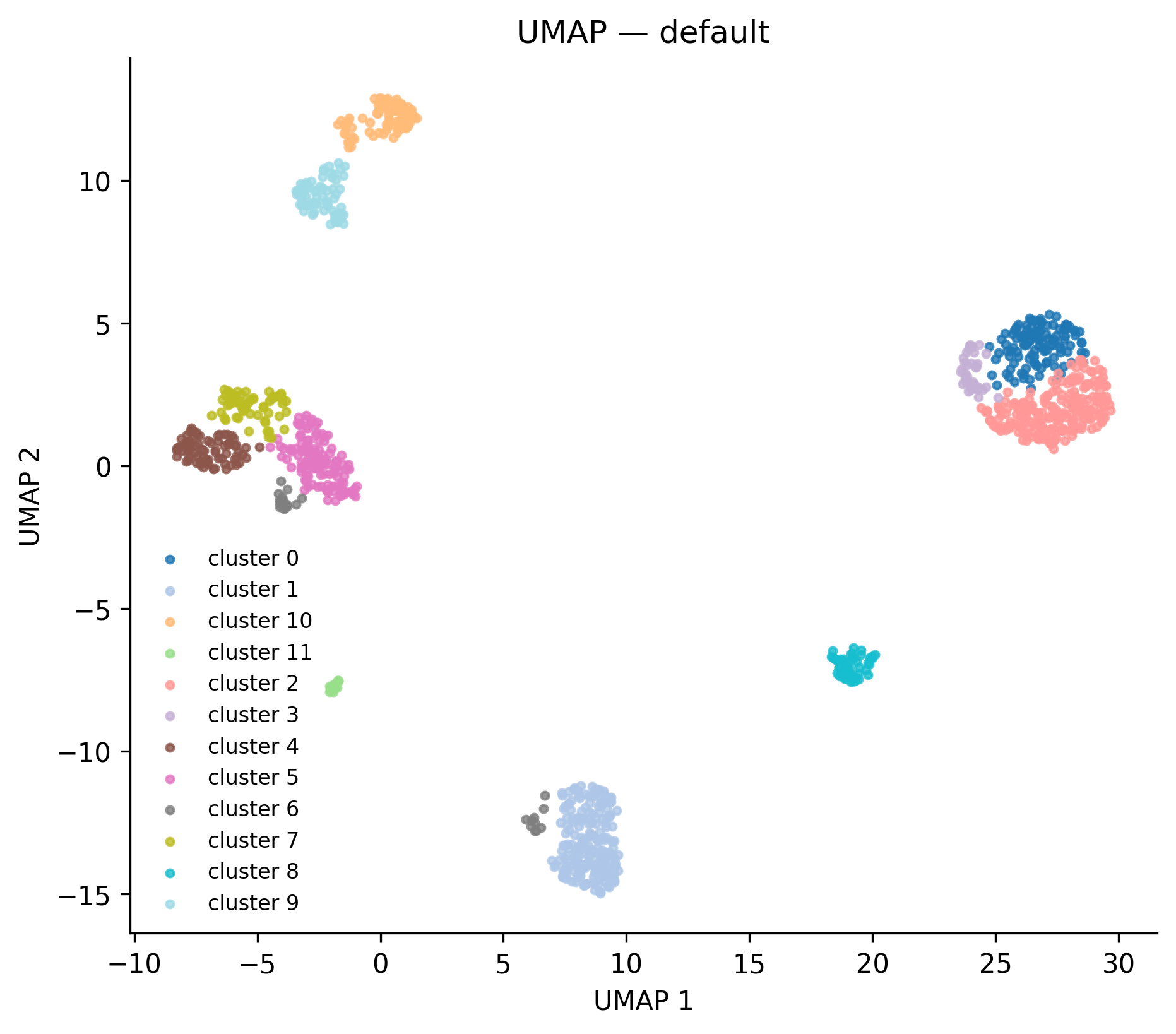 Real output from the
 full_v8 reference run — 12 leiden clusters.
When to interpret it: After clustering, as a sanity check that clusters
are well-separated and biologically interpretable. Cells of the same cluster
should form spatially coherent regions. Scattered single-cell islands in the
middle of a large cluster usually indicate that n_neighbors is too low.
 Real output: 12 clusters ranging from 14 cells (cluster 11) to 210 cells (cluster 2).
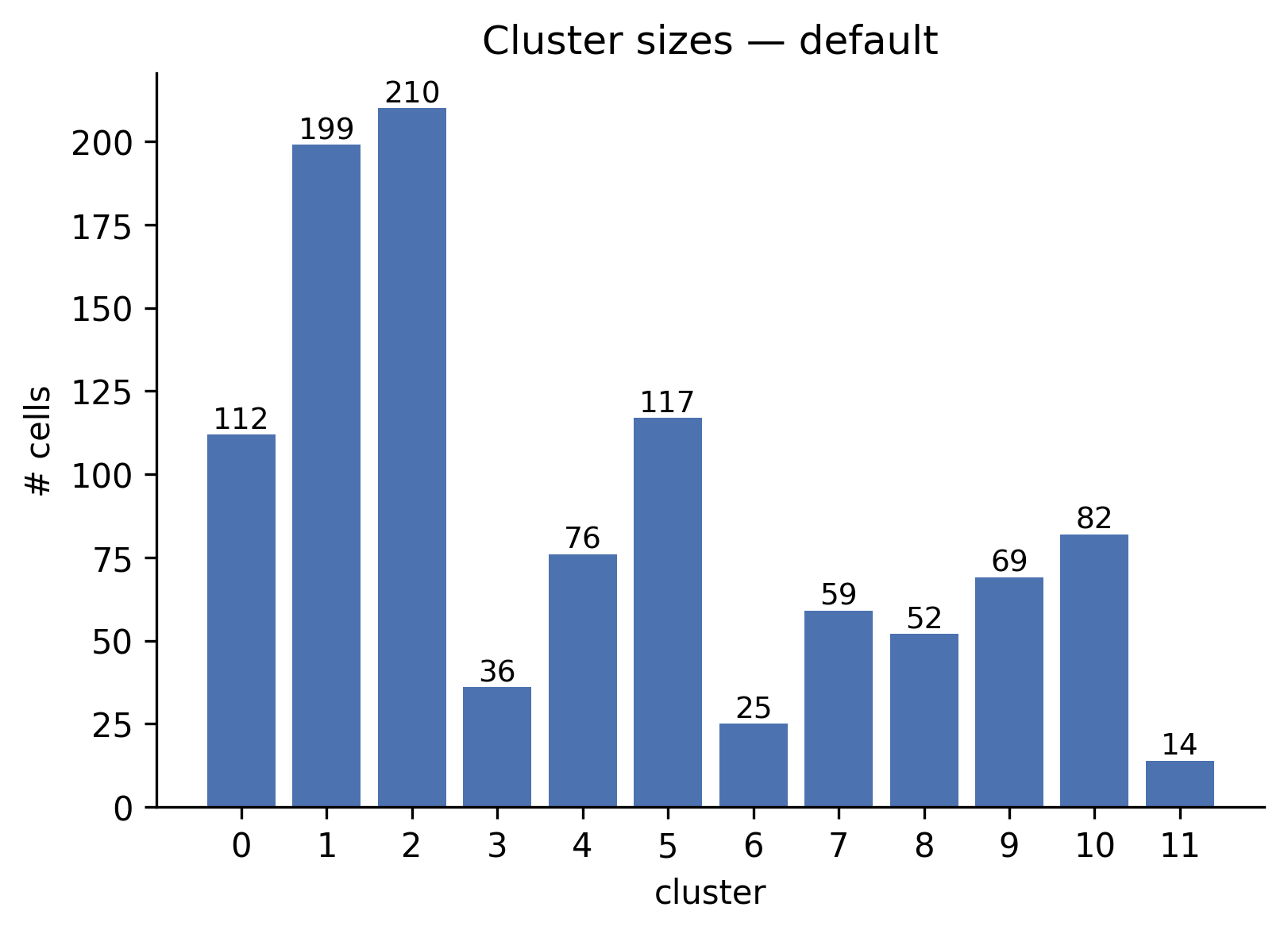
cluster_sizes
Registered names: cluster_sizes_matplotlib, cluster_sizes_plotly
Data shape: (adata, ds_id) — AnnData with obs["leiden"] populated.
What it shows: A bar chart with one bar per cluster, annotated with the exact cell count. Bars are sorted by natural cluster label order.
When to interpret it: Immediately after clustering. One dominant cluster
containing > 80% of cells combined with many tiny clusters (< 5 cells) is a
sign that resolution is too high or that n_neighbors is too large for the
dataset size.
peak_qc
Registered names: peak_qc_matplotlib, peak_qc_plotly
Data shape: dict with keys:
| Key | Type | Content |
|---|---|---|
peaks_per_chrom |
dict[str, int] |
Number of peaks per chromosome |
per_cell_pas |
list[int] |
Number of PAS detected per cell |
peak_widths |
list[int] |
Width in bp of each peak |
per_cell_reads |
list[int] |
Total reads per cell |
What it shows: A 2x2 panel: (1) peaks per chromosome bar chart, (2) histogram of PAS detected per cell, (3) histogram of peak widths in bp, (4) histogram of reads per cell.
When to interpret it: Before clustering, to validate peak-calling quality.
A bimodal per_cell_pas distribution may indicate a doublet population. Very
wide peaks (> 500 bp) may indicate that peackcalling parameters need tighter
window constraints.
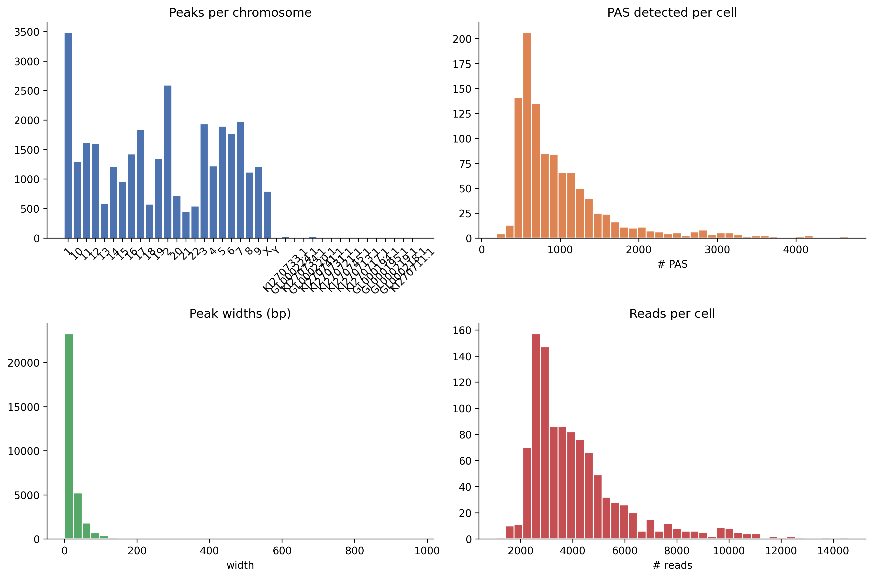 Real output from the
 full_v8 run — chromosomal coverage (top-left), PAS-per-cell
distribution (top-right), peak-width histogram (bottom-left), reads-per-cell
(bottom-right).
volcano
Registered names: volcano_matplotlib, volcano_plotly
Data shape: Either a pd.DataFrame with columns ["log2fc", "qvalue",
"pas_id"] (legacy), or a dict with:
| Key | Type | Default | Description |
|---|---|---|---|
df |
DataFrame | required | Fisher or NB result with log2fc, qvalue columns |
fdr |
float | 0.05 | FDR threshold for the horizontal dashed line |
log2fc_thresh |
float | 1.0 | log2fc threshold for vertical dashed lines |
n_label |
int | 10 | Top-N points annotated with gene_id (if column present) |
cluster1, cluster2 |
str | — | Included in figure title and meta sidecar |
strategy |
str | — | Test strategy name, included in title |
n_cells_cluster1, n_cells_cluster2 |
int | — | Cell counts, included in title |
What it shows: A scatter of all tested PAS. X-axis: log2fc (positive =
higher in cluster 2). Y-axis: -log10(qvalue). Horizontal dashed line at
-log10(FDR). Vertical dashed lines at ±log2fc_thresh. Significant points
colored red (up in cluster 2) or blue (down in cluster 2).
When to interpret it: After ema switch diff. The upper-right quadrant
contains PAS used more in cluster 2; upper-left contains PAS used more in
cluster 1. Points near the horizontal line but inside the vertical lines have
significant but small effect size; approach with caution.
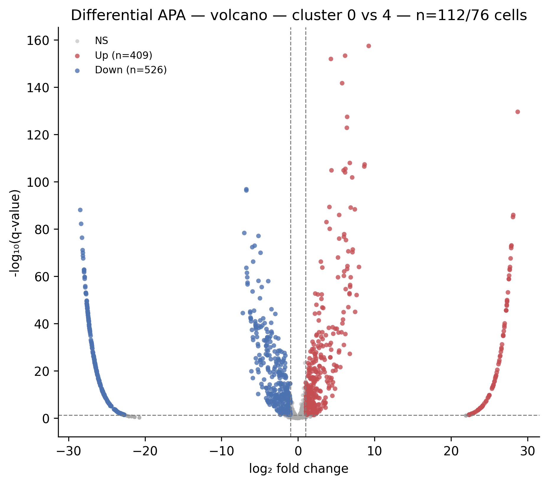 Real output from
 ema switch diff on the full_v8 run. Red dots = PAS used more
in cluster 4; blue dots = PAS used more in cluster 0. The top-N genes are
auto-labeled.
pdui_distribution
Registered names: pdui_distribution_matplotlib, pdui_distribution_plotly,
pdui_distribution_scanpy
Data shape: (adata, score_key) — AnnData with obs["leiden"] and
obs[score_key] populated with per-cell PDUI scores (float in [0, 1]).
What it shows: Per-cluster violin plots of the PDUI score. Each violin shows the distribution of PDUI values across all cells in that cluster. Medians are shown as horizontal lines.
When to interpret it: After running ema switch length with
--pdui-method classic. Clusters with PDUI median near 1.0 tend toward
longer 3' UTRs. Clusters with median near 0.0 tend toward shorter UTRs.
Bimodal violins within a cluster indicate heterogeneous PAS usage and may
warrant sub-clustering.
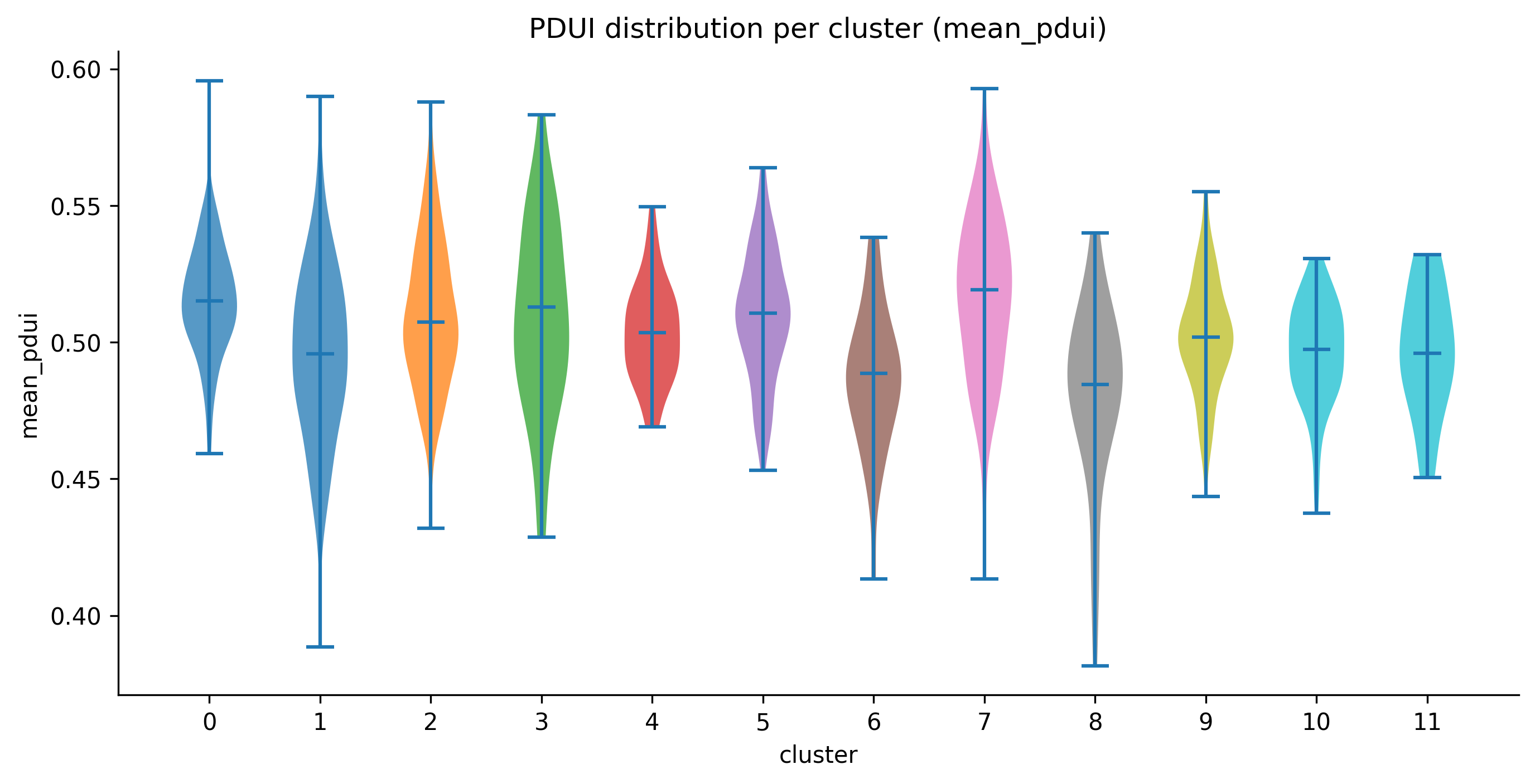 Real output: per-cluster violins of
 mean_pdui across the 12 leiden clusters.
proportion_heatmap
Registered names: proportion_heatmap_matplotlib, proportion_heatmap_plotly
Data shape: dict or (pdui_df, adata) tuple:
| Key | Type | Default | Description |
|---|---|---|---|
pdui_df |
DataFrame | required | Output of proportion strategy (long format) |
adata |
AnnData | required | AnnData with obs["leiden"] |
cluster_key |
str | "leiden" |
Obs column for cluster labels |
top_n |
int | 50 | Number of most-variable PAS to display |
What it shows: A PAS x cluster heatmap. Rows are the top-N PAS by cross-cluster variance (most discriminating). Columns are clusters. Cell values are mean within-gene proportion across cells of that cluster. Color scale: viridis (dark = 0, bright = 1).
When to interpret it: After ema switch length --pdui-method proportion.
A PAS with a bright cell in one cluster and dark in another is shifting its
within-gene proportion across conditions. Use this as a visual triage before
running fisher or nb_pairwise.
entropy_distribution
Registered names: entropy_distribution_matplotlib,
entropy_distribution_plotly
Data shape: (adata, score_key) — AnnData with obs["leiden"] and
obs[score_key] holding per-cell Shannon entropy values.
What it shows: Per-cluster violin plots of Shannon entropy. Mirrors
pdui_distribution but for the entropy metric. Color scale uses viridis
rather than tab10.
When to interpret it: After ema switch length --pdui-method shannon.
Progenitor or cycling cell populations often show higher entropy (more uniform
PAS usage) than terminally differentiated cells. Clusters where the violin is
collapsed near 0 bits contain cells with highly focused PAS usage.
diff_agreement
Registered names: diff_agreement_matplotlib, diff_agreement_plotly
Data shape: dict[str, set[str]] mapping strategy name to the set of
significant PAS IDs declared by that strategy.
What it shows: A symmetric N x N heatmap where each cell [i, j] is the Jaccard similarity between the significant PAS sets of strategy i and strategy j. Diagonal = 1.0 (each strategy agrees with itself). Off-diagonal values show pairwise strategy agreement. Annotated with numeric values.
When to interpret it: When running ema switch diff with multiple
--diff-method values simultaneously. High Jaccard (> 0.7) between fisher
and nb_pairwise indicates the results are robust. Low Jaccard (< 0.3)
indicates the two tests are sensitive to different PAS or that one is
anti-conservative (Fisher) relative to the other.
Only rendered when at least 2 strategies are provided; returns empty list otherwise.
length_shifts
Registered names: length_shifts_matplotlib, length_shifts_plotly
Data shape: pd.DataFrame indexed by gene_id with one column per
cluster pair (e.g., "0_vs_1", "0_vs_2"). Cell values are PDUI delta
(positive = lengthening in cluster 2, negative = shortening).
What it shows: A gene x cluster-pair heatmap using a red-blue diverging colormap. Red = 3' UTR lengthening in cluster 2. Blue = shortening. Rows are capped at the top 50 genes by maximum absolute delta to keep the figure readable.
When to interpret it: As a summary view across multiple cluster pair comparisons. Genes that shift across many pairs (multiple colored cells in a row) are consistent APA regulators. Genes that shift only in one pair may reflect cluster-specific biology or low-coverage noise.
pas_overlap
Registered names: pas_overlap_matplotlib, pas_overlap_plotly
Data shape: dict[str, set[str]] mapping dataset ID to the set of PAS
identifiers detected in that dataset.
What it shows: For 2 datasets: a 3-bar Venn-equivalent showing counts of
PAS unique to dataset A, shared by both, and unique to dataset B. For 3+
datasets: an UpSet plot (via the upsetplot library) showing intersection
sizes for all combinations.
When to interpret it: After merging multiple datasets to assess how much of the PAS landscape is shared. A low overlap fraction (< 30% shared) suggests that the datasets sample different parts of the transcriptome or that detection sensitivity differs substantially between them.
atlas_snap_diag
Registered names: atlas_snap_diag_matplotlib, atlas_snap_diag_plotly
Data shape: dict with keys:
| Key | Type | Description |
|---|---|---|
snapped |
int | Number of peaks that matched an atlas entry within the distance threshold |
unsnapped |
int | Number of peaks beyond the threshold |
snap_distances |
list[int] |
Distance in bp for each snapped peak |
What it shows: A 2-panel figure. Left: bar chart of snapped vs. unsnapped counts with percentage. Right: histogram of snap distances with the median marked by a red dashed line.
When to interpret it: After atlas snapping in ema run. A high unsnapped
fraction (> 30%) may indicate that the snap distance threshold is too tight or
that the atlas does not cover the tissue type being analyzed. A median snap
distance > 50 bp suggests the atlas PAS are not well-calibrated to this
protocol's read 3'-end distribution.
cluster_match_sankey
Registered names: cluster_match_sankey_matplotlib,
cluster_match_sankey_plotly
Data shape: pd.DataFrame from ClusterMatchStrategy.match() with
columns dataset_id, original_cluster, canonical_cluster,
match_confidence, matched_to.
What it shows: One stacked bar column per dataset. Each bar segment
represents one original cluster colored by its canonical cluster ID. Segment
opacity encodes match_confidence (opaque = high confidence). A legend maps
canonical cluster colors. Segment labels show original → canonical mapping.
When to interpret it: After ema switch match. A canonical cluster that
appears in all dataset columns with similar color means all datasets agree that
cell population exists. A canonical cluster appearing in only one dataset
column is a population unique to that sample.
match_confidence
Registered names: match_confidence_matplotlib, match_confidence_plotly
Data shape: pd.DataFrame from ClusterMatchStrategy.match() (same as
cluster_match_sankey).
What it shows: A heatmap with rows labeled {dataset}:{original_cluster}
and columns labeled by canonical cluster ID. Cell value is match_confidence
(0 when no match). Color: YlOrRd (light yellow = 0, dark red = 1). Cells with
confidence > 0 are annotated with the numeric value.
When to interpret it: As a companion to cluster_match_sankey for
auditing specific cluster pairs. High off-diagonal values (a cluster matched
to two canonical IDs with similar confidence) indicate ambiguous assignment
and may warrant re-running with a different n_top_markers or switching from
marker_overlap to mnn.
tile_timing
Registered names: tile_timing_matplotlib, tile_timing_plotly
Data shape: list[dict] — per-tile timing records with schema:
| Key | Type | Description |
|---|---|---|
dataset_id |
str | Dataset identifier |
chrom |
str | Chromosome name |
tile_idx |
int | Tile index within chromosome |
tile_start, tile_end |
int | Genomic coordinates |
wall_seconds |
float | Elapsed wall time for this tile |
What it shows: One subplot per dataset. Bar chart sorted descending by
wall_seconds. Tiles more than 2 standard deviations above the mean are
highlighted red (outliers).
When to interpret it: After ema run to diagnose performance. Outlier
tiles (red bars) on specific chromosomes often indicate high coverage regions
(e.g., mitochondrial chromosome, highly expressed ribosomal genes) that cause
clustering of reads and slow the peak-calling step. Use these to tune
--threads or tile size parameters.
resource_timeline
Registered names: resource_timeline_matplotlib, resource_timeline_plotly
Data shape: dict with keys:
| Key | Type | Description |
|---|---|---|
samples |
list[dict] |
Periodic samples: {"elapsed_s": float, "rss_gb": float, "cpu_pct": float} |
annotations |
list[dict] |
Stage markers: {"label": str, "elapsed_s": float} |
What it shows: A dual-axis line chart. Left y-axis: RSS in GB (blue line with shaded fill). Right y-axis: CPU % (orange dashed line). Vertical grey dotted lines mark pipeline stage transitions with rotated labels.
When to interpret it: After any ema run to understand memory and CPU
usage over time. A flat RSS line followed by a sudden spike indicates a step
that materializes a large array (e.g., the count matrix densification during
clustering). CPU dropping to near 0% between stage transitions indicates I/O-
bound steps or the GIL blocking parallelism.
gene_track
Registered names: gene_track_matplotlib, gene_track_plotly
Data shape: A GenePanel dataclass (from ema.viz._gene_track_helpers)
or dict with "panel" key and optional "top_n_clusters" (int, default 12):
GenePanel fields:
| Field | Type | Description |
|---|---|---|
gene_id |
str | Gene identifier |
chrom, start, end |
str, int, int | Genomic span |
strand |
str | "+" or "-" |
pas_ids |
list[int] |
PAS identifiers in genomic order |
pas_positions |
list[int] |
Genomic coordinate of each PAS |
clusters |
list[str] |
Cluster labels in display order |
n_cells_per_cluster |
list[int] |
Cell count per cluster |
reads |
ndarray (n_clusters, n_pas) |
Total reads per PAS per cluster |
reads_per_cell |
ndarray (n_clusters, n_pas) |
reads / n_cells_per_cluster |
proportions |
ndarray (n_clusters, n_pas) |
Within-gene proportion (rows sum to ~1) |
isoforms |
list[tuple[str, list[tuple[int, int]]]] |
Optional: (transcript_id, [(exon_start, exon_end), ...]) |
What it shows: A stacked subplot figure for one gene. When isoform data is present, the top row shows exon bars per isoform with intron backbone lines and strand arrows. Below it, one row per cluster shows vertical bars at each PAS position. Bar height = reads/cell (depth-normalized). Bar color = within- gene proportion on the viridis scale (dark = 0%, bright = 100%). Each bar is annotated with the proportion percentage. A shared colorbar legend is added at the right.
Up to top_n_clusters (default 12) clusters are rendered, prioritized by
total read count at the gene. The y-axis cap is the 95th percentile of
reads/cell across all rendered clusters, preventing one outlier PAS from
squashing the other bars.
When to interpret it: After ema switch geneview for a specific gene.
A gene with a dominant distal bar in one cluster and a dominant proximal bar
in another cluster is an APA candidate. The proportion annotation makes it
easy to see whether a visual shift in bar height is meaningful (e.g., 80% vs
20%) or marginal.
The figure title includes chromosome coordinates and strand. Use it to cross-reference the gene structure with a genome browser.
Figure sidecar convention
Every figure written by save_matplotlib or the plotly equivalent is
accompanied by a <stem>.meta.json sidecar file at the same path. The sidecar
is written by ema.viz._meta.write_figure_meta.
Fixed schema keys (always present, never overwritten by the caller):
| Key | Description |
|---|---|
figure_name |
Filename stem of the figure |
viz_strategy |
Registered strategy name (e.g. "umap_matplotlib") |
generated_at |
ISO 8601 UTC timestamp |
peakatail_version |
Version string from importlib.metadata |
Plot-specific keys are merged in by the strategy's render method and
vary by plot type (e.g., n_cells, cluster_key, fdr, gene_id).
Manifest files in each figures/ directory:
figures_INDEX.json— machine-readable list of all figure entries, each containingstem,files(sibling artefacts), andmeta(sidecar content).figures_INDEX.md— human-readable summary grouped by plot type, with a concise tag line per figure. Written byema.viz._meta.write_figures_index.
The manifest is regenerated after every command that produces figures. Read
figures_INDEX.md in any output directory to get an overview of what every
figure shows without opening the individual files.